Thursday, October 14, 2010

cai guo-qiang's odyssey

photo by Douglas Newman of Cai 
Last week I had the incredible opportunity to volunteer to work with the Chinese-born artist Cai Guo-Qiang on a massive gunpowder drawing he was commissioned to do for the Arts of China Gallery at the Museum of Fine Arts, Houston. As a volunteer, I cut stencil out of cardboard that he drew so he could spread gunpowder over the stencil and onto specially prepared hemp paper panels. I worked Monday, Wednesday and Thursday mornings. The piece is made of 42 panels approximately 8 feet high by 5 feet wide (my estimation).

After the cardboard was cut out and the gunpowder was applied by Cai, fuses and dried plants were added then lit on fire inside the warehouse where the art was created. An explosion and smoke followed - all was caught on live streaming video that I watched from the comfort of my apartment. Here is a link to the ignition ceremony: http://www.culturemap.com/series/cais-odyssey/

The resulting gunpowder drawing will be on permanent display at the gallery as a backdrop to its rotating antiquities collection. The finished piece will be revealed this week at the opening of the new gallery. It was an unforgettable opportunity to see another artist at work and to participate in the creation of such a massive piece of art.

I am currently working with ink and brush on a new project as I was inspired by the beauty of the brushstrokes Cai made and the references to Chinese calligraphy. I hope to paint on a small scale with ink and brush then blow the images up on a projector and paint them much larger. We'll have to see how it comes out!

Thursday, September 23, 2010

superman at tradition bank

I entered Superman in an SAO (Student-Alumni Organization) show and got in! The show is currently running at Tradition Bank on Montrose Boulevard across from Glassell. Here is a photograph of the painting in situ. I am really excited to start the year off with a bang.

My intermediate painting class is going well and I will soon post my first three paintings from that class as soon as I have my studio set up to take photographs - I just moved apartments so my studio is still a work in progress. Thanks for your patience with my work. And thanks always for your support!

Wednesday, July 28, 2010

matte-tastic

Here is a photo of my work up on the upstairs wall at Glassell. These two pieces were created using matte medium (which is basically liquid plastic) to create transferred images from inkjet printouts. I had so much fun creating these pieces! To do these I printed out images of pop singers, in this case, Ke$ha and Lady Gaga and poured the matte medium over them. I let it dry for 24 hours, then washed off the paper in the sink. The resulting images are a bit blurry and oh-so-matte-tastic.

For this one, I pixelated a photograph of Ke$ha in Photoshop and then used poured sheets of matte medium in bold colors that I then cut into squares for the background image. For the hazy overlay I poured matte medium over the actual photograph of the pop singer as I described above. I also made a $ out of matte medium using a magazine image, since she has that symbol in her name, and glued it onto the top of the piece. It's sort of a collage using a variety of matte medium techniques. The image is 9x12" mounted on a piece of Bristol board.

The other piece features Lady Gaga in what I'm calling a mash-up of two images. One is a pixelated version of Lady Gaga and the other is the pop singer herself. Both images were manipulated in Photoshop. I then printed the images out on my inkjet printer, poured matte medium over them, and let them dry overnight. After washing the paper off, I cut them into strips and glued them to a piece of 12x9" Bristol board leaving the edges raw.

My instructor liked the pieces so much he immediately hung them on the wall outside the classroom at Glassell where they remained for the rest of the summer semester. Pretty cool stuff. I'm going to have to explore this technique some more and see where it takes me...

Tuesday, July 20, 2010

chemical transfers

In my summer mixed media class we spent several weeks studying transfer techniques. For the first week this involved using chemicals, specifically a blender marker by Chartpak and Citrasolv household cleaner to transfer images from copy machines and magazines. Here are two finished projects. They are loosely based on the work of the artist Robert Rauschenberg. The first one measures 9" x 12" and is on Bristol board. It features images of the BP oil spill including two of President Obama on the beach picking up tar balls. The color is very subdued.

The second piece is 12" x 18" and is also on Bristol board. The theme is mainly military and the color is also subdued, except for the lower left corner where the palm trees and sunset are. Using the Chartpak marker was a challenge as it has a very strong smell, despite the label which says non-toxic. I gave myself a three-day headache since I used it indoors without proper ventilation! I strongly recommend using this marker outdoors. Despite the headache, I really enjoyed working with this technique because the end result is a seamless, smooth image made up of many different images. I am learning so much in this class!

Monday, July 12, 2010

the blotted line

My summer class has gotten off with a bang! We've been learning all sorts of techniques including this first one using a blotted line from brush and India ink onto watercolor paper (9x12") and colored with watercolor pencils. I traced a model from a magazine onto tracing paper and inked small sections (about 1/2" sections at a time) then blotted the wet ink onto the watercolor paper to achieve this uneven line.

After practicing on several images I was successful enough to do a dragonfly for an invitation to a party we're throwing for my husband's cousin. I was thrilled to translate my new-found knowledge into something practical! I wish I could upload a copy of the invitation but it won't show up here. The final result was pretty nice, though, I must say.

Sunday, July 11, 2010

tuff tony


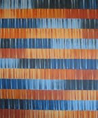
It has been a long time since my last posting, I know, but here is my most recent painting. I actually completed it in June but have been too busy to photograph it and post it online. The past few months have been really crazy due to some nasty migraines that are thankfully pretty much under control now thanks to a new medication. This painting will complete my series of striped paintings where I drew inspiration from Barkley L. Hendricks' work - work which began in Feburary of 2010. I set out to paint a set of paintings with a unified theme and did just that. They expressed my interest in color schemes and unifying rigid grid systems with hand painted marks. This one was all about the gold stripe. It is acrylic on canvas, 30x36". I am interested in expanding my painting vocabulary so I am taking a mixed media class this summer (my next posting will be all about that) and a new painting class in the fall. More stuff to come!

Tuesday, April 27, 2010

fta

My latest painting is FT A, acrylic on canvas, 2010, after Barkley L. Hendrick's FTA, oil on linen canvas, 1968. I really pushed myself here to line up the strokes and to amp up the composition by adding the diagonal line and the two white racing stripes. Although the original painting was about the army, mine is a bit more playful. I learned to use gel medium to seal the taped edges and that helped tremendously! Compared to my other painting New Orleans, this one taped like a charm! I'll never go back to matte medium to seal tape lines again!

Tuesday, April 13, 2010

sisters

I just wanted to post that this painting, Sisters, has made it into the Visual Arts Alliance Show at Williams Tower! The show will run from April 29 to May 28, 2010. The opening reception will be on Thursday night, April 29 from 6-8pm. All are invited to attend. This is a painting I made for my sister-in-law, Anna, last year. It is oil on canvas and done in many, many layers. There is also a layer of gesso which gives it the texture that caused the drips to run ragged. It took me about six months to finish this painting. I am so excited I made it in the show!

iii

Another thing the curator of the Galveston Arts Center said to try was a horizontal format. This is based on another Barkley L. Hendrick's painting entitled JSBIII. I'm calling mine III. Although the white columns look solid, they are actually painted like the other ones. I think I like the vertical format better.

new orleans

Hi all! This is a painting inspired from Barkley L. Hendrick's New Orleans Niggah. I'm calling it New Orleans. I used the slanted lines to mimic the angle at which the model was standing in the original painting. I got positive feedback from the curator of the Galveston Arts Center who liked that this painting was of a subject (the diagonal lines) on a ground (the white background). He encouraged me to make more like this one so I'm working on a couple right now in this vein. More to come...

Thursday, March 11, 2010

north philly

This is the next in the Barkley L. Hendrick series based on his North Philly Niggah. I'm calling mine North Philly, acrylic on canvas, March 2010.

superman

Here is my finished painting based on Barkley L. Hendricks' Icon for My Man Superman. I'm calling it Superman, acrylic on canvas, March 2010. 

Thursday, March 4, 2010

on the energy required to paint

Nobody ever told me that there will be times when I won't have the energy to paint. But it happens to me all of the time. I am trying to be more disciplined and paint even when I don't have an inspiration. I am trying to be more steady in my painting habits.

It just so happens that at the moment I have a tremendous amount of energy and inspiration. I want to paint. I need to paint. I have to paint! Seeing the Barkley L. Hendricks show was great. I love his use of color and his compositions. It is all together in each of his pieces. This one is one of my favorites, Icon for My Man Superman (Superman never saved any black people - Bobby Seale), 1969, oil, acrylic, and aluminum leaf on linen canvas, 59.5x48".

My plan is to take the composition and colors and create a new painting using my style of linear strokes with stripes of color. More photos to come.

Thursday, February 11, 2010

finale

In the end I decided to do a rough copy of Joan Miro's Catalan Peasant in the Moonlight. The first photo is mine. The second photo is the original. The green at the top of mine did not photograph well - it is much more saturated and grass-greeny. I have mixed feelings about copying someone else's work. I guess it stems from my feeling that it lacks imagination. But maybe I just admired the simple composition and the use of color so much I had to imitate it.
I know the composition is not exactly the same. If I had wanted it to be the same I would have projected the original onto the canvas. But I didn't. I wanted to get the same feeling using my own gestures and not looking at the original when I did mine. I'm not completely happy with the end product. I think it looks clumsy and forced. But then again the original has a certain amount of carelessness about it. I don't know. I enjoyed doing this, though. Maybe I'll make a striper for this one.

Monday, February 8, 2010

phase two

I have continued working on the Green Jello painting and am now in phase 2. Working in a composition similar to Joan Miro's Catalan Peasant in the Moonlight, I am focusing on color and texture. I am just so inspired by Joan Miro's use of color and simple lines. The yellow is like a shooting star at the top and the blue and red at the bottom bring your eye around the composition and back to the large red section. Everything you see in the light green will eventually be black - gesso or paint of some sort. That should add an element of drama and define positive and negative spaces in the whole piece.

Tuesday, February 2, 2010

green jello

I had a dream where I was watching a street performer dive into and swim through a huge cube of green jello. So that has inspired me to paint in GREEN! This is the background for my new painting. I am taking photos along the way to document the building of the piece. More to come.

Sunday, January 31, 2010

the blue stripe

So I’m working on my latest painting. Not getting anywhere helpful. First I painted the background with golds and browns like in Joan Miro’s self-portrait. Then I added paint in gesture-like strokes – reds, yellows and black. Then I covered it with gesso applied with a palette knife. Then I thought it should be darker overall so I added two glazes – one umber and the other ochre. Then I stepped back and looked at it and decided it was too brown.

So then I added a bright blue stripe. Now I hate it. What do I do next? Pitch it? Add more stripes? Gesso?

I should have taken Francesca’s suggestion to photograph it along the way. Now I’m stuck with a bright blue stripe I'm not sure what to do next. Maybe I should just move on to something else. I'm sure it will come to me eventually...

up to speed


To bring you up to speed… In the summer of 2009 I worked on this painting:


Woven. Oil on canvas. 24x30.


And in December 2009, this one:


Pastels. Acrylic on canvas. 18x24.


Working in acrylics for the first time was a thrill. I found that I can use the same thick body of paint and achieve a similar blending of colors using the same techniques I used with oil paints – only I could work a lot faster. This has enabled me to turn out many paintings fairly quickly. In January 2010 I finished 8 paintings! I have been working on the Joan Miro striper series taken from color class. The first one I did in the fall of 2009:


Painting. Acrylic on canvas. 16x16.


The other four I did in January 2010:


Harlequin’s Carnival. Acrylic on canvas. 16x16.


Constellation. Acrylic on canvas. 16x16.


Rooster. Acrylic on canvas. 16x16.


Hand Holding a Bird. Acrylic on canvas. 16x16.


My next adventure was to explore texture through the use of gesso applied with a palette knife. Here are the three I did in that vein:


Painting of Painting by Joan Miro. Acrylic on canvas. 30x36.


Black Stripes. Acrylic on board. 16x20.


Blur. Acrylic on canvas. 16x16.